This lesson shows how graphs turn data into pictures—so patterns become easier to spot and easier to predict.
Watch: Sam’s Slime Shop
Watch this 2-minute story before the lesson. Join Evie and Mark to turn Sam’s weekly slime sales into a graph, one point at a time.
Watch, pause, and try: Pause at 0:58 to plot week three’s seven jars. At 1:47, discuss whether an upward trend guarantees more sales next week. Then explore the graphing activities below.
The Secret Behind the Slime Sales
Meet Sam, a 12-year-old who started selling homemade slime at school. Each week, Sam writes down how many jars were sold:
| Week | Jars Sold |
|---|---|
| 1 | 2 |
| 2 | 5 |
| 3 | 7 |
| 4 | 10 |
| 5 | 14 |
At first, it’s just numbers.
But when Sam plots them on a graph, something amazing happens — the numbers turn into a picture.
A line that goes up! 📈
“Wow,” Sam says, “I can actually see my business growing!”
That’s the power of graphs:
- Tables help you store data.
- Graphs help you see patterns and tell a story quickly.
Turning Data into Pictures
A graph is basically a map from input → output.
- x-axis (horizontal): the input (often time, week number, or something you control)
- y-axis (vertical): the output (the result you measure)
- point (x, y): one real observation (one “data example”)
For Sam’s slime:
- x = week number
- y = jars sold
- (3, 7) means “week 3, sold 7 jars.”
Two kinds of graphs you’ll use a lot
1) Line graph (connect the dots)
Good for tracking change over time: steps per day, temperature each hour, slime sales per week.
2) Scatter plot (don’t connect the dots)
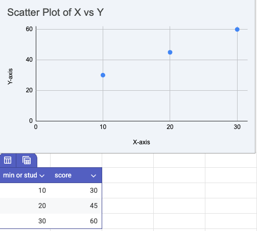
Good for comparing two measurements: height vs arm span, practice time vs score.
Reading a graph like a detective
When you look at a graph, ask:
- Direction: Are we going up, down, or flat?
- Speed: Is it rising fast or slowly?
- Smooth vs messy: Are the points close to a path (predictable) or scattered (noisy)?
- Outliers: Is there a point that doesn’t fit the rest?
That “smooth vs messy” idea matters a lot later—because noise makes prediction harder.
Activity 1 — Graph Your Own Story
Choose something you can measure for a week:
- Hours you sleep each night
- Minutes spent gaming
- Temperature outside
- Steps walked
Pick something you can measure for 7 days (same choices you already have):
- hours of sleep
- minutes spent gaming
- temperature outside
- steps walked
Do this
- Record the numbers in a table.
- Make a line graph (paper or a digital tool like Desmos).
- Answer:
- What day was highest? Lowest?
- Is your trend up/down/flat?
- Predict Day 8. (Explain your reasoning.)
Compute “average change per day”:
Activity 2 — Guess the Graph
Draw (or print):
- Increasing
- Decreasing
- Flat
- Noisy zig-zag
Now ask:
- Which one is hardest to predict—and why?
- Which could be “improving running time”?
- Which could be “plant growing”?
- Which could be “pizza left over time”?
Activity 3 — Make Graph Art
Who says math can’t be creative?
- Use coordinates (x, y) to draw a shape or pixel art picture.
- Try making a heart, star, or smiley face using points.
- You can use grid paper or Desmos for this.
This shows that even art has math hiding inside it!
NEW Activity 4: Feature → Outcome Scatter Plot
Machine learning usually learns from many examples that look like points.
Pick two measurements (real or made-up data):
- hours slept → quiz score
- minutes practiced → shots made
- height → arm span (classic)
Make a scatter plot. Then answer:
- Do you see a trend?
- Would a straight line be a reasonable “model”?
- Are there outliers?
This sets up Lesson 3 perfectly.
How This Connects to Machine Learning
When computers learn, they don’t “see stories.” They see data points.
- Each dot = one example
- The axes = features (measurable inputs)
- A model is a rule that tries to predict an output from inputs
If the points make a clear pattern, prediction is easier.
If the points are scattered, prediction is harder (more noise).
That’s why graphing isn’t just math—it’s a basic tool for data science.
Takeaway Message
Graphs turn math into pictures — and pictures make patterns visible.
Every time you make or read a graph, you’re taking the first step into data science.
Additional Resources
Activities
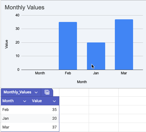
- Create bar graphs comparing favorite snacks or sports.
- Introduce scatter plots (two related measurements, like height vs. arm span).
- Use Google Sheets to visualize real-world data. Example: ShallWeLearn M4ML Lesson 2 Resource
Bar Graph
Scatter Plot